
Fresh 2 Death
‣ OVERVIEW
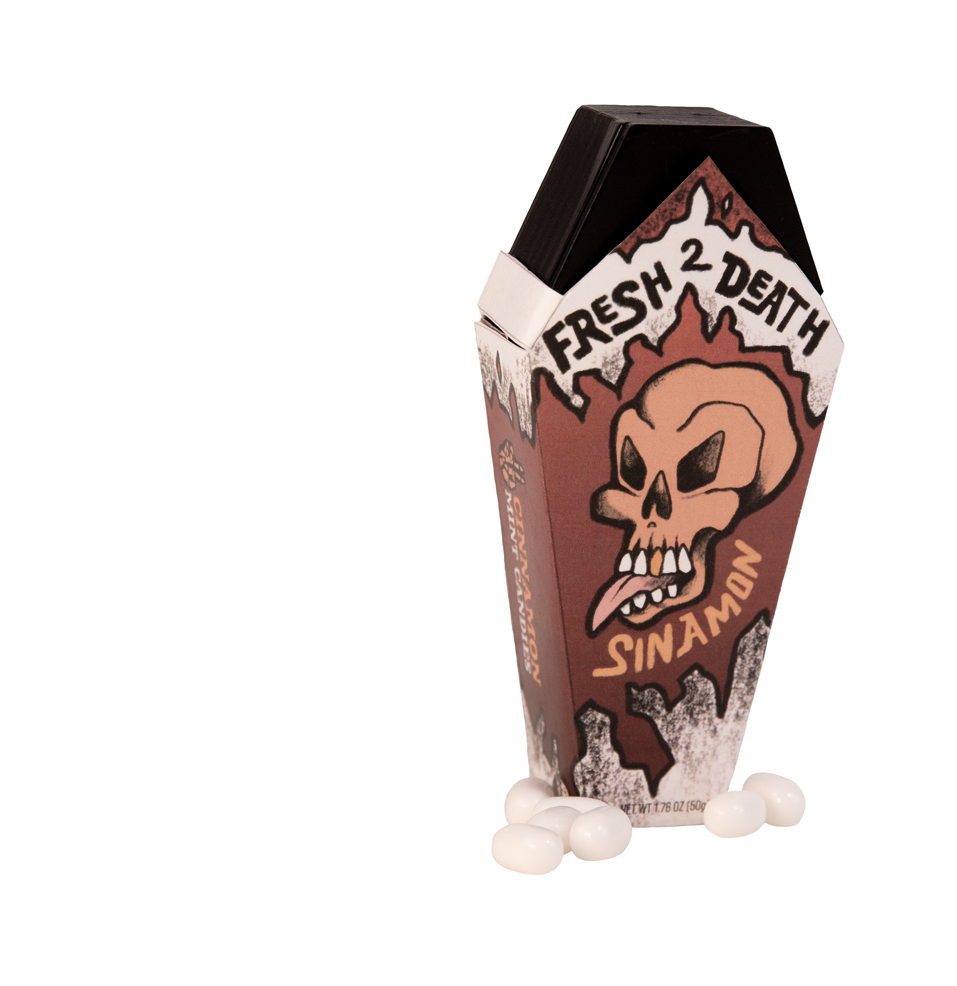
This project focused on creating a product with an unconventional dieline or shape. I developed Fresh 2 Death—a mint brand with a coffin-shaped container and a bold, tattoo-inspired attitude. From the branding to the physical structure, I wanted every element to stand out, especially on a crowded retail shelf.
‣ OBJECTIVE
The goal was to design a package that felt edgy and cool, while also being practical enough to fit at a checkout counter. I wanted Fresh 2 Death to have a strong identity—something that said “death to bad breath” with both humor and visual impact. The biggest challenge was making sure the 3D printed coffin container was the right size—compact enough to be store-friendly, but still big enough to feel like a complete, eye-catching product.
‣ PROCESS
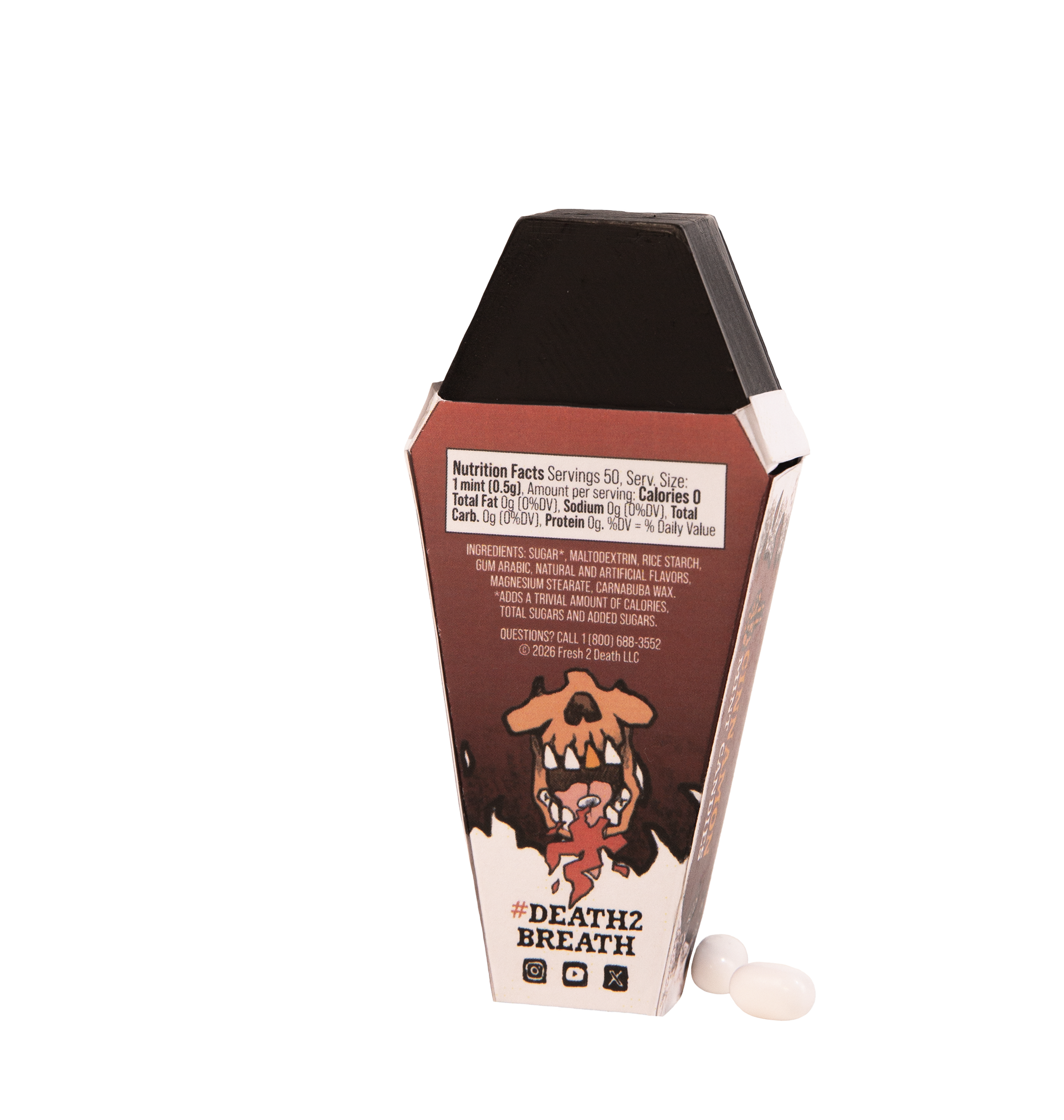
I started with sketches and mood boards inspired by traditional tattoo flash art, mixing skulls, flames, and icy motifs to reflect the minty freshness with a rebellious twist. I then modeled the coffin shape digitally and went through several iterations to make sure it hit the right dimensions. Once printed, I designed labels and graphics to match the tone—clean, crisp, and a little cheeky. Every part of the process was about making something functional and fun to look at.
‣ RESULT
The final product is a bold, shelf-ready package that’s hard to ignore. It captures personality through both form and branding, with a unique structure that makes it more than just another mint tin. Fresh 2 Death pushes creative packaging and shows how design and humor can work together to create something truly memorable.
‣ TOOLS USED
Illustrator, Photoshop, Canon Digital Camera