
Plant Holic Package Design

‣ OVERVIEW
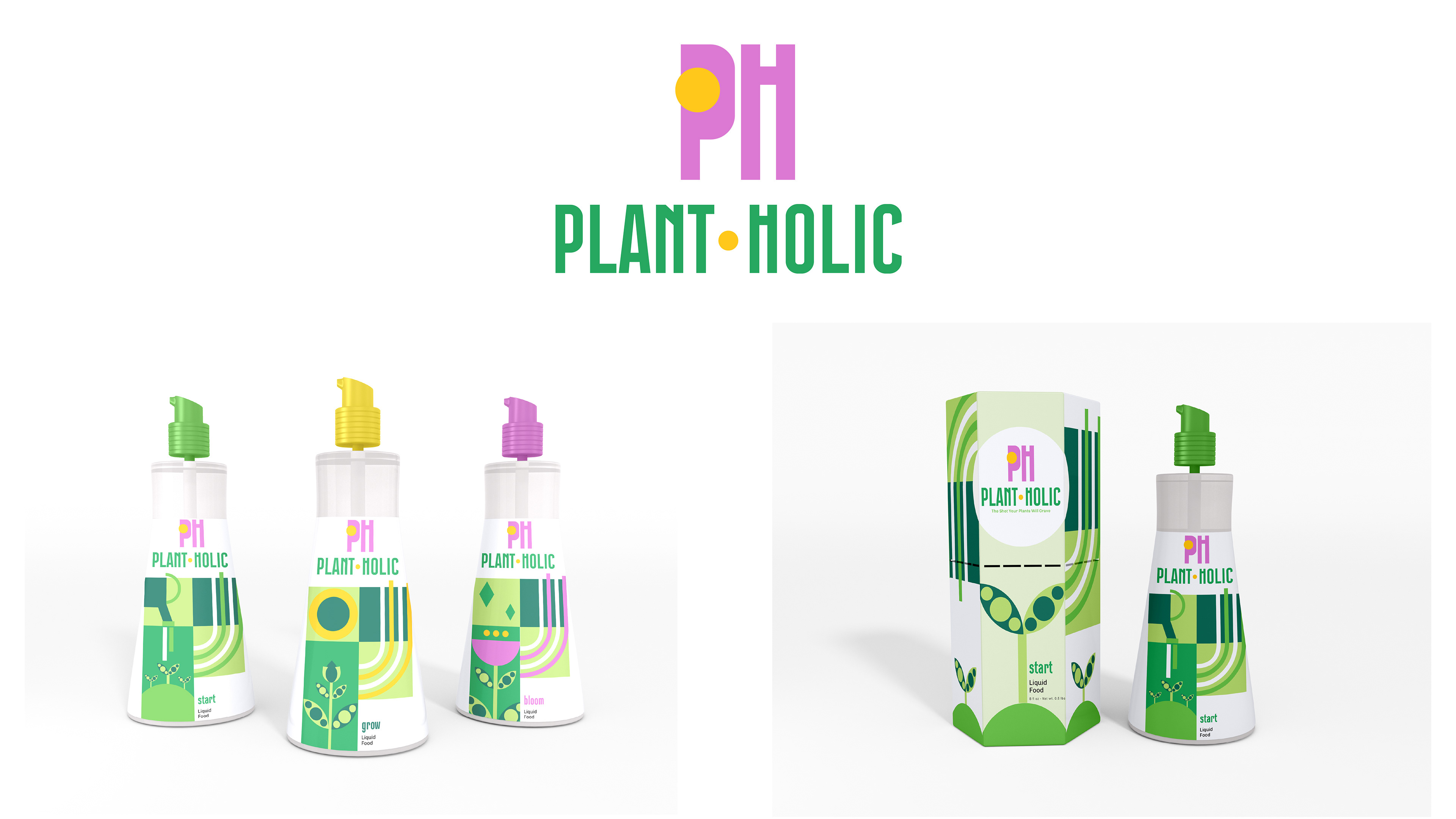
For this project, we were asked to choose an art movement and build a brand around it—designing packaging for three product variations. I created Plant Holic, a high-end plant care line inspired by my own obsession with plants (no shame!). I chose the Bauhaus art movement because of its clean geometry and balance between function and beauty. The goal was to visually reflect the transformation and growth of plants through abstract shapes and bold structure.
‣ OBJECTIVE
I wanted Plant Holic to feel modern and elevated—something that would appeal to plant lovers who care about design just as much as their monstera. The challenge was blending the core elements of Bauhaus with a sense of organic transformation, without making it feel too cold or sterile. It also meant creating three distinct flavor or formula variations that felt cohesive within the brand, yet unique on their own.
‣ PROCESS
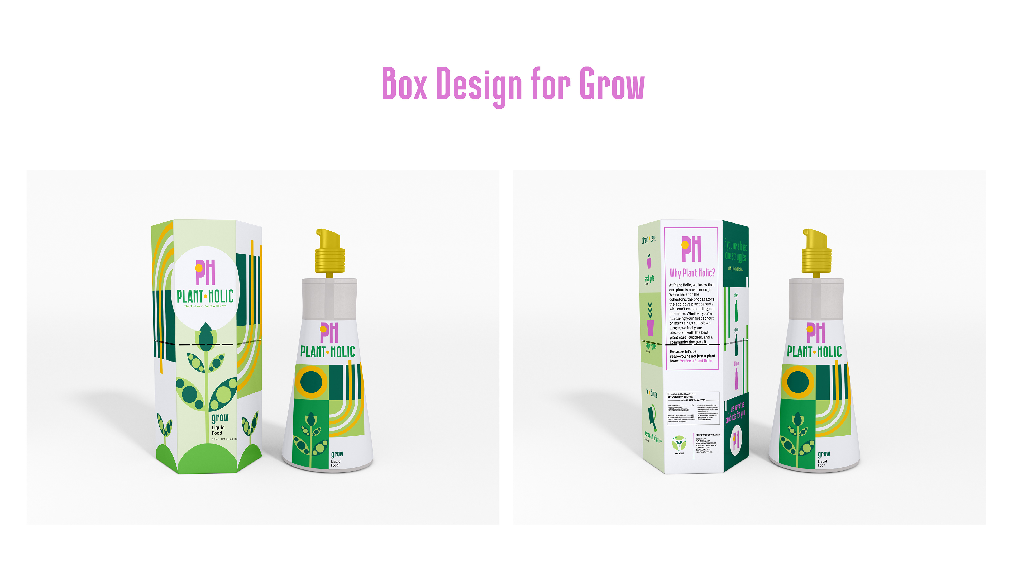
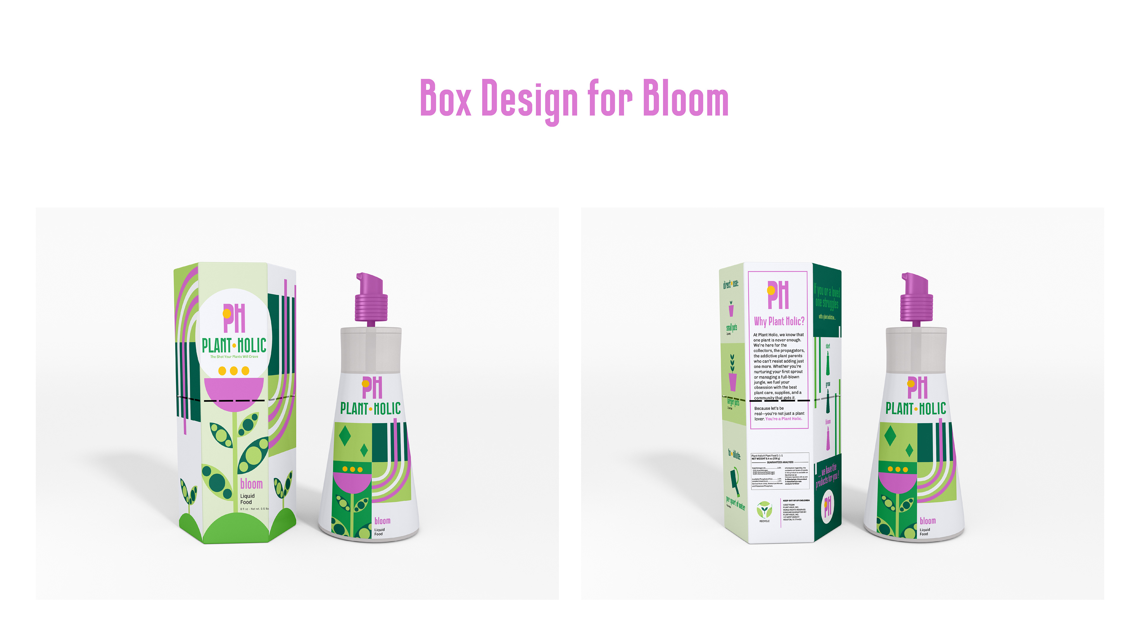
I started by studying Bauhaus color palettes and layouts, pulling inspiration from its use of form, grid, and symmetry. I then worked those ideas into a series of geometric illustrations that symbolized different stages of plant life—rooting, growth, and bloom. Each variation had its own color system and label design, but all shared a common Bauhaus framework. From logo to layout, everything was designed to feel intentional, structured, and lush at the same time.
‣ RESULT
Plant Holic is a blend of visual art and plant care—bringing an abstract, modern aesthetic to a product that usually leans rustic or earthy. It’s sleek, bold, and speaks to a niche audience of design-conscious plant lovers. This project allowed me to merge personal passion with thoughtful design strategy, creating a brand that’s both functional and art-forward.
‣ TOOLS USED
Illustrator, Photoshop