
WHALES SNACK REDESIGN
‣ OVERVIEW
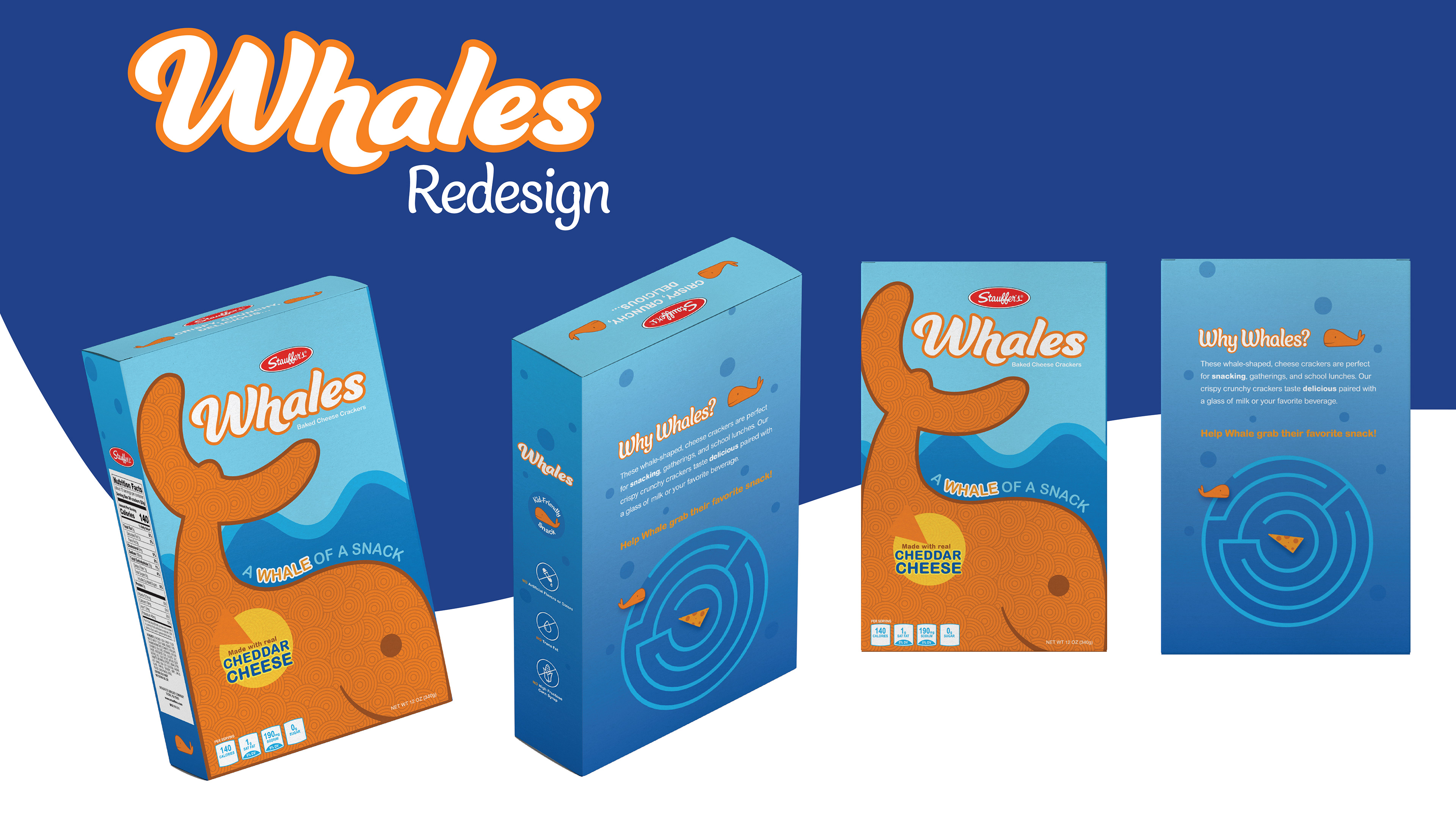
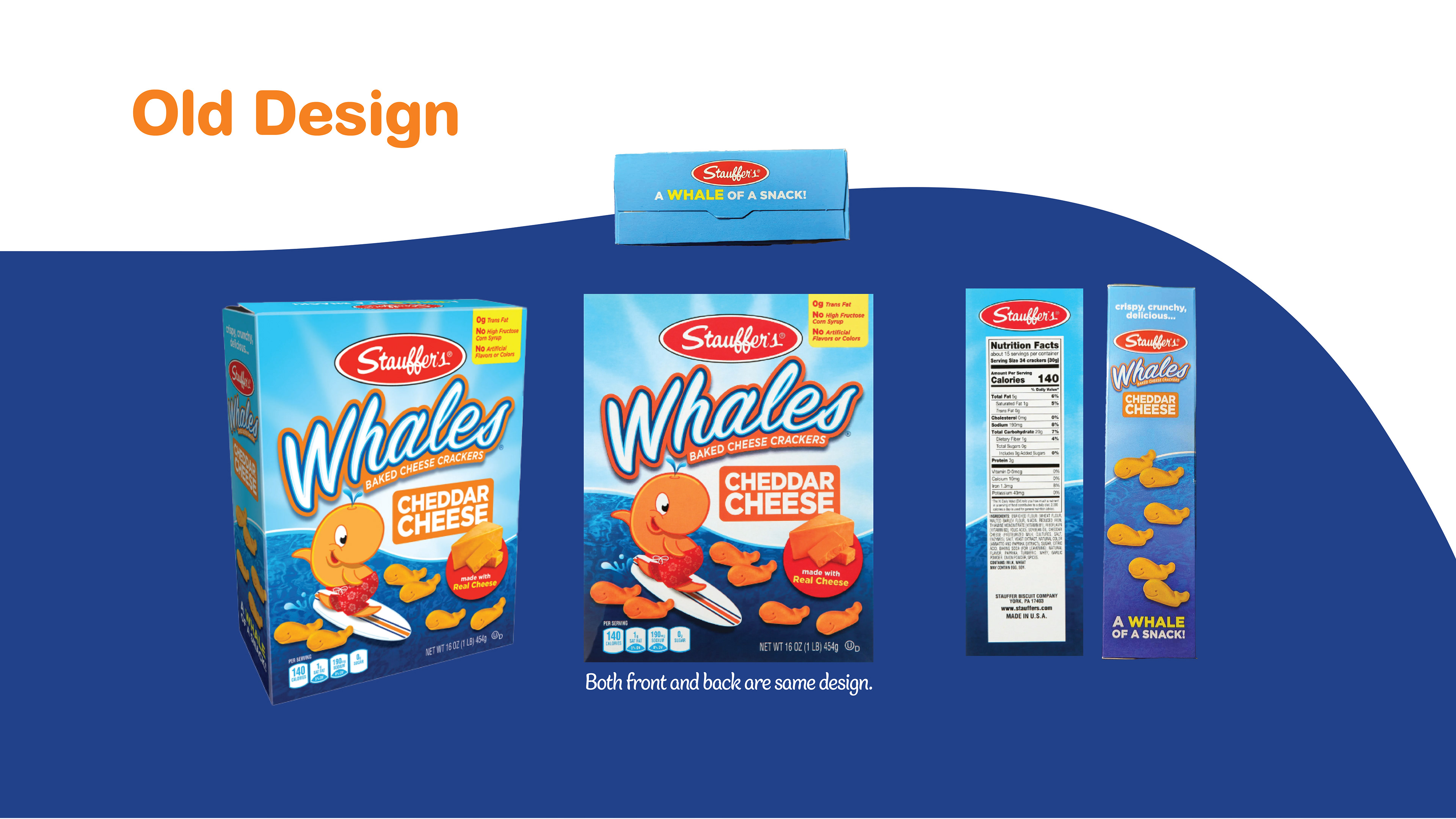
For this project, we were asked to redesign the packaging for an existing boxed product. I chose Whales—a cheddar snack I used to love as a kid. While the snack itself holds up, the packaging felt outdated and didn’t really connect with its likely audience, kids. I saw an opportunity to reimagine the box in a way that felt more playful, engaging, and memorable.
‣ OBJECTIVE
The goal was to create packaging that appeals to children while still feeling clean and eye-catching on a shelf. The biggest challenge was keeping it fun without being too chaotic—and making sure it stood out from other snacks in the same category. I also wanted to bring back something I always loved growing up: the games and mini activities that used to be printed on the back of boxes.
‣ PROCESS
I started by looking at competitor packaging—what colors, characters, and design styles they used—and took notes on what stood out visually. From there, I built a design that used bold colors, bubbly typography, and friendly illustrations to bring personality to the brand. I designed a game for the back of the box to make the experience more interactive, giving kids something to do while they snack—just like I remembered from my own childhood. Every design decision was made with that audience and nostalgic feeling in mind.
‣ RESULT
The final design gives Whales a fresh look that’s kid-friendly, shelf-ready, and fun to interact with. It reflects my ability to blend branding with audience insight, and to use design not just for visual appeal—but for sparking joy and engagement.
‣ TOOLS USED
Illustrator, Photoshop